TL;DR: xy is the fastest Python charting engine, written in Rust, built for interactive charts over any number of rows.
At Reflex, we build tools for Python developers. We're most known for the Reflex framework, a framework for building full-stack web apps in pure Python.
Today we release xy: the most performant Python charting library, written in Rust.
Explore the xy repository on GitHub.
Existing Python charting libraries slow down on large datasets. Past a few hundred thousand points, a chart takes minutes to render, hover, and zoom. The charts don't look particularly good, either.
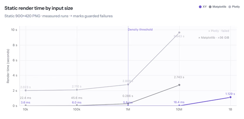
xy renders millions of points and keeps hover, zoom, and selection responsive. It beats every existing charting library by orders of magnitude in number of points plotted and action speed.
You can install xy today with a simple command:
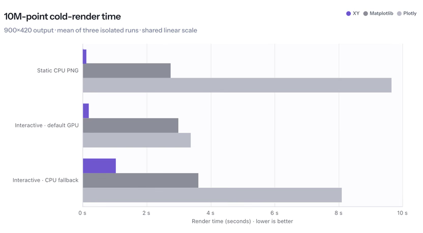
How is xy so fast?
Most Python charting libraries create one separate object for every single point. This means charts with large numbers of points waste swaths of compute drawing points on the same pixels, with no change in the end result.
xy sends the browser only what the screen can show; for a large scatter plot, xy builds a fixed-size density surface, for a long line, it runs M4 decimation, which keeps the peaks and troughs that shape the line. When zooming in, xy refines the visible region and switches to exact points once the view is small enough. A ten-million-row scatter prepares its payload in 10 ms and sends 258 KiB. The payload stays at roughly 258 KiB from one million rows through one hundred million.
Additionally, due to the way xy handles rendering, one can still zoom and hover over any point and read its exact values despite the pixel-based approach.
What xy enables
Plots of the entire dataset. An embedding matrix, a residual array, or a table of prediction scores runs from 1 million to 100 million rows. Plotting one currently starts with df.sample(100_000), so subsets are chosen before data is visualized. xy plots the full array in 10 ms. Outliers and tail behavior that a 1 percent sample removes are on the screen.
Dashboards with live data. A single page can hold 50 charts, all live and all interactive. Existing libraries impose a chart budget per page, because browsers run out of WebGL contexts and the older charts go blank. chart.append() updates an existing chart, meaning dashboards can connect to a live datasource without requiring a rebuild.
Charts as standalone files. A 10-million-point interactive scatter exports to 258 KiB of HTML. The Plotly equivalent is 259 MiB. 258 KiB is small enough to commit to a repo or attach to an email, and 259 MiB requires hosting it somewhere. The previous option for sharing a chart at this size was a static image.
Time series at full length. Telemetry, market tick data, and log-derived metrics reach tens of millions of points per series. The current sequence is to pick a resample interval, notice something at that interval, then re-query the source at finer granularity to look at it. xy renders the full series in one pass with every spike and drop intact, and zoom resolves them without a second query.
The API
xy's API is declarative. You build a chart from marks, axes, and annotations.
ExpandCollapse
Export a chart to a self-contained HTML file, or append new data to it without rebuilding it:
You install xy via pip (pip install xy). This bundles the Rust core, the Python package, and the JavaScript client, so you don't need a Rust compiler, Node.js, npm, or a CDN. xy runs in Jupyter, VS Code, Colab, Marimo, and standalone HTML, on Linux, Windows, and macOS with Python 3.11 or newer.
Coming from Matplotlib
xy is designed as a drop-in replacement for matplotlib workflows. Change import matplotlib.pyplot as plt to import xy.pyplot as plt, and your existing pyplot code runs on xy. This initial release supports just the 2D plotting methods in Matplotlib 3.11. If you call something it doesn't support, it'll raise an error.
xy's limitations vs other charting libraries
Plotly, Bokeh, and Matplotlib cover more chart types; xy doesn't draw polar or 3D charts, and it is still under development.
Our roadmap
From here, we'll grow xy from a fast 2D charting library into a complete plotting system for Python, and wire its live data channel straight into Reflex. We have an ambitious roadmap. Even in its current form, we think xy is a very strong experience for charts in Python. We hope you'll try it:
The source, examples, benchmarks, and roadmap are on GitHub.