


Spider Plot: What It Is, When to Use It, and How to Create One in 2026
Learn what a spider plot is, when to use it, and how to create one in Python, Excel, R, and MATLAB. Complete guide with best practices for May 2026.
 Tom Gotsman
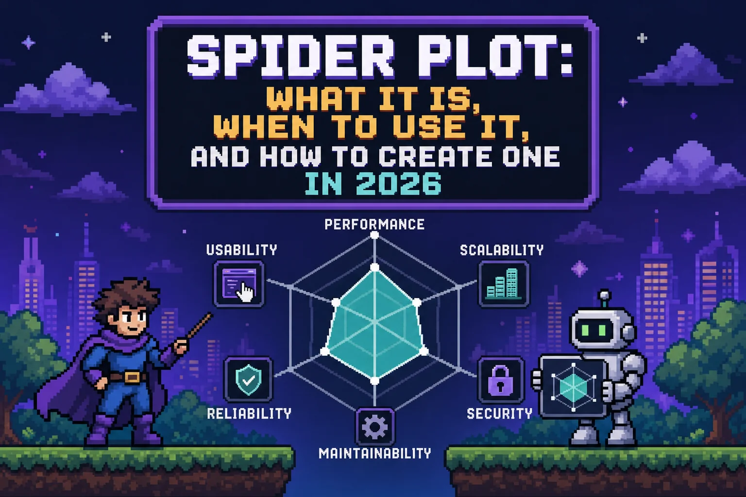
TLDR:
- Spider plots (also called radar charts or radar plots) compare multiple entities across shared dimensions in one chart
- Best for 5-8 variables; normalize scales before plotting to avoid distortion
- Create them in Python (Matplotlib/Plotly), Excel, R (ggradar), or MATLAB
- Common in sports analytics, clinical trials, and product comparisons
- Reflex builds interactive spider plots in pure Python without JavaScript
What is a Spider Plot (Radar Chart)?
A spider plot, also known as a radar chart or radar plot, is a graphical method of displaying multivariate data as a two-dimensional chart, where three or more quantitative variables are each represented on axes radiating from the same central point. The result looks exactly like what the name implies: a web-like polygon connecting data points across each axis.
You'll encounter this chart type under several names. Radar chart, web chart, spider graph, star plot, cobweb chart, polar chart, and Kiviat diagram all refer to the same core structure. The naming varies by industry and tool, but the underlying mechanic stays consistent: each variable gets its own axis, all axes share a common origin, and connecting the plotted values forms a closed polygon.
Spider Plot vs. Radar Chart
The terms are interchangeable in practice. "Radar chart" tends to appear in Excel and general business contexts, while "spider plot" shows up more in scientific literature, clinical research, and programming environments like Python and MATLAB. Neither is more correct. Your choice of name usually reflects the tool or community you're working in.
Core Structure
Every spider plot shares three structural elements:
- Axes arranged radially from a center point, typically spaced at equal angles
- A scale on each axis representing the range of that variable's values
- A polygon connecting the data values, one per axis
Multiple datasets can appear on the same radar chart as overlapping polygons, which is where spider plots earn their reputation for quick visual comparison. The relative shape of each polygon tells the story before you even read the labels.
Spider Plot Use Cases and Applications
Spider plots shine brightest when you need to compare multiple entities across the same set of dimensions at a glance. They appear most frequently in food science and sports analytics: comparing athletes across speed, strength, agility, endurance, and technique in a single visual is exactly the kind of problem spider plots solve well.
Where Spider Plots Work Best
- Sports analytics: player performance profiles across multiple metrics simultaneously, making it easy to spot whether an athlete excels in one area while underperforming in another
- Employee reviews: rating candidates across skills like communication, leadership, and technical ability gives hiring managers a quick side-by-side read
- Product comparison: showing how competing products score across shared criteria lets stakeholders see tradeoffs without scanning multiple charts
- Food and sensory science: profiling taste, texture, aroma, and appearance together in one chart is a staple of sensory evaluation workflows
The Oncology Use Case
In clinical research, a specific variant called the oncology spider plot tracks individual patient tumor measurements over time relative to baseline. As described in published oncology literature, it presents individual changes in tumor measurements over time relative to baseline tumor burden, letting clinicians see both population trends and outlier patient responses in one chart.
When to Avoid Them
Spider plots struggle with more than six or seven axes, where polygons become cluttered and differences get hard to read. They also distort perception when axis scales differ. For those scenarios, a grouped bar chart or small multiples usually communicates more clearly.
How to Create Spider Plots in Python, Excel, R, and MATLAB
Each tool has its own path to a spider plot. Here's what matters for each one.
Python (Matplotlib and Plotly)
Matplotlib requires a bit of manual setup: you define the angles for each axis using numpy.linspace, convert to polar coordinates, and plot the polygon. For more options, see our guide to Python visualization libraries. The official matplotlib radar chart example describes it as a chart "also known as a spider or star chart" and walks through the polar subplot approach step by step.
Here's a practical Matplotlib spider plot comparing two players across five performance metrics:
ExpandCollapse
For something faster, Plotly's go.Scatterpolar handles the coordinate math for you and produces interactive charts with hover states out of the box.
Here's the same comparison built with Plotly's radar chart API:
ExpandCollapse
Excel
Select your data, then go to Insert > Other Charts > Radar and pick your preferred subtype. "Radar with Markers" works best for most use cases. Formatting the fill area, adjusting axis scales, and layering multiple series are all available through Chart Tools. Excel handles the basics well, though scaling becomes a problem when your variables have different units.
R
Two packages dominate here. The fmsb package takes a data frame with max and min rows defined, then creates the chart with a single function call. For ggplot2 users, the ggradar package extends the familiar grammar-of-graphics syntax and gives you more control over styling and faceting. ggradar is the better pick if your workflow already lives in the tidyverse. If you need to build a Python web app around your visualizations, there are frameworks that make the process straightforward.
MATLAB
MATLAB's spider_plot function, available on GitHub and MATLAB File Exchange, is the go-to community tool. It accepts a matrix of values, axis labels, and optional styling parameters. For production dashboards in Python, consider alternatives that integrate with modern web frameworks.
Choosing the Right Tool
| Tool | Best For | Key Limitation |
|---|---|---|
| Matplotlib | Custom, publication-ready charts | More manual setup |
| Plotly | Interactive web charts | Larger dependency |
| Excel | Business stakeholders | Scaling across different units |
| R (fmsb/ggradar) | Statistical workflows | Steeper setup for non-R users |
| MATLAB | Engineering/research teams | Requires license or File Exchange |
Spider Plot Best Practices and Common Mistakes
Good spider plots follow a short list of rules that are easy to break.
Normalize your axes before plotting. When variables use different units or scales, the polygon shape reflects unit choices more than actual data patterns. Convert everything to a common range, typically 0 to 100 or z-scores, before you plot.
Axis ordering matters more than most people realize. Readers focus on the polygon shape, which changes substantially depending on how you arrange variables around the chart. There is no objectively correct order, so test a few arrangements before committing.
For variable and series counts, keep radar charts to 5 to 8 axes and no more than 4 to 5 overlapping polygons. Beyond that, shapes blend together and the chart stops communicating.
A few common mistakes worth avoiding:
- Filled polygons with high opacity obscure series underneath, so use semi-transparent fills to keep all layers visible.
- Skipping normalization when axes have different units causes the shape to reflect measurement choices instead of real patterns.
- Adding too many variables in hopes the chart shows everything typically results in a cluttered polygon that shows nothing clearly.
- Reaching for a spider plot when a bar chart would be faster to read adds unnecessary complexity for the audience.
When comparisons involve ranked data or a single variable matters most, a bar chart wins. For detailed data comparisons, tables can complement spider plots by showing exact values. Spider plots earn their place when the overall shape across all dimensions is the actual story.
Why Spider Plot Matters in Data Visualization and Analytics
Spider plots earn their place in a data team's toolkit because they consolidate what would otherwise require multiple charts into one readable shape. As Jaspersoft notes, radar charts condense all multivariate information into a single polygon with multiple axes, instead of scattering comparisons across separate graphs.
The core benefits in practice:
- Multivariate comparison at a glance: see how multiple entities score across all dimensions simultaneously, without toggling between views
- Pattern recognition: the polygon shape reveals strengths and weaknesses faster than scanning a table
- Performance benchmarking: comparing an entity against a baseline or competitor is immediate when both polygons share the same axes
- Decision support: stakeholders absorb tradeoffs visually without needing to interpret raw numbers, similar to how a finance dashboard presents key metrics at a glance
- Domain flexibility: works equally well in clinical oncology, sports analytics, HR reviews, and product comparisons
That said, spider plots are one tool, not the default. They work best alongside dashboards that combine bar charts, trend lines, and stat displays instead of replacing them entirely. Check out dashboard templates to see how different chart types work together.
Final Thoughts on Spider Plots in Your Data Stack
Spider plots condense multivariate comparisons into one readable shape, but only when you keep them simple. Whether you're creating a spider plot with Matplotlib or Excel, normalized axes and manageable polygon counts make the difference between clarity and confusion. You can test a few axis orders, keep fills semi-transparent, and trust that when the shape tells the story faster than a table would, you've picked the right chart type.
FAQ
Spider plot vs radar plot: is there any difference?
No. Spider plot and radar plot refer to the same chart type with identical structure and function. "Radar chart" appears more in Excel and business contexts, while "spider plot" is more common in scientific literature and programming environments like Python and MATLAB.
What's the best tool for creating a spider plot in 2026?
Plotly is the best choice for interactive web dashboards because it handles polar coordinates automatically and produces charts with hover states. For publication-ready static charts, use Matplotlib. For business stakeholders who need quick comparisons, Excel's built-in radar chart works fine as long as you normalize your axes first. If you want to build a full web app around your spider plots, Reflex lets you wrap Plotly radar charts into production-ready Python apps without writing any JavaScript.
Can I build an interactive spider plot dashboard without JavaScript?
Yes. Python frameworks like Reflex let you build full web dashboards with Plotly spider plots without writing any JavaScript. You write your visualization logic in Python, and the framework handles the web interface and interactivity.
How many variables should a spider plot have?
Keep spider plots to 5-8 axes maximum. Beyond that, the polygon shape becomes too cluttered to read and differences between series get lost. If you need to compare more than 8 variables, split them into multiple charts or use grouped bar charts instead.
When should I use a spider plot instead of a bar chart?
Use a spider plot when the overall profile shape across all dimensions matters more than precise values for individual variables. In sports analytics, seeing an athlete's complete performance polygon is more useful than reading separate bars for speed, strength, and agility. If one variable is most important or you need exact value comparisons, a bar chart communicates faster.
What is a radar chart used for in data visualization?
A radar chart (spider plot) is used to display multivariate data across three or more quantitative variables on axes sharing a common origin. Radar charts are popular in sports analytics for player profiling, product comparisons, employee skill assessments, and sensory science evaluations. The polygon shape formed by connecting data points across axes makes it easy to compare performance profiles at a glance.
How do I create a radar plot in Python?
You can create a radar plot in Python using Matplotlib's polar subplot approach or Plotly's go.Scatterpolar function. Matplotlib requires manual angle setup with numpy.linspace and polar coordinates, while Plotly handles the coordinate math automatically and adds interactivity like hover states. For full radar chart dashboards without JavaScript, Python frameworks like Reflex let you wrap Plotly radar plots into production web apps.
More Posts
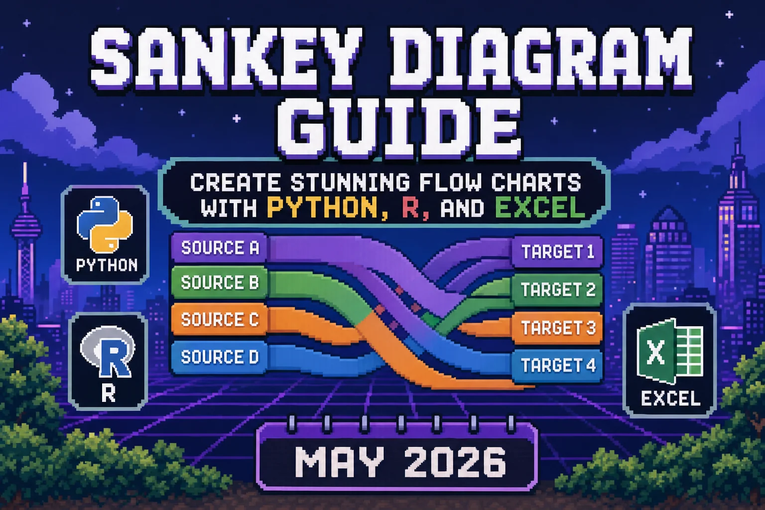
Make sankey diagram flows with Python, R, Excel. Sankey plot, sankey chart, and sankey graph examples with Plotly, networkD3. Complete guide for May 2026.

Upgrading your Reflex app to v0.9.0: the optional database extra, single-port production builds, the auto-setter change, and removed APIs.

We benchmarked computer use against auto-generated API endpoints on the same admin panel. 53 steps and 551k tokens vs 8 calls and 12k tokens.
