


Blog posts
2024-02-16
Reflex v0.4.0
We’re excited the announce the next major release of Reflex!
With Reflex 0.4.0 we’re releasing new core components and a theming system to make it easier to build apps that look great out of the box.
Our goal is for Reflex to be the easiest way to go from an idea to a fully built web app.
Since we launched Reflex, we’ve been working to maintain the balance of having an ergonomic, batteries-included web framework that is also flexible enough to handle any type of use case.
Reflex 0.4.0 takes another step in this direction with our new core components and themes. The components come with high-level styling options, and different components within an app can be styled together with a unified theme. If you want more customizability, you can modify most aspects of the component internals to suit your needs.
If you’re creating a new project, simply install reflex to automatically use the latest version.
pip install reflex
If you have an existing project, upgrade your version of reflex
pip install --upgrade reflex
Since the core components have changed from Radix, existing apps will need to run the migration script to keep using Chakra.
reflex script keep-chakra
This will convert all components in your app to the new namespace.
For example, if you used an rx.box in your app, it will be converted to an rx.chakra.box.
You will still be able to use any Chakra component through the rx.chakra namespace.
The Chakra Docs have been moved and updated to reflect the new namespace.
We’re switching our core components to be based on the Radix UI component library. For example, rx.button will now render a Radix button. Browse the new core component library to see all available components in the core namespace.
Many components feature high level styling props, such as setting the color_scheme or the variant. If you need to customize further, you can use any CSS as always.
The components also have interactive docs in their API Reference so you can see how different props change the component.
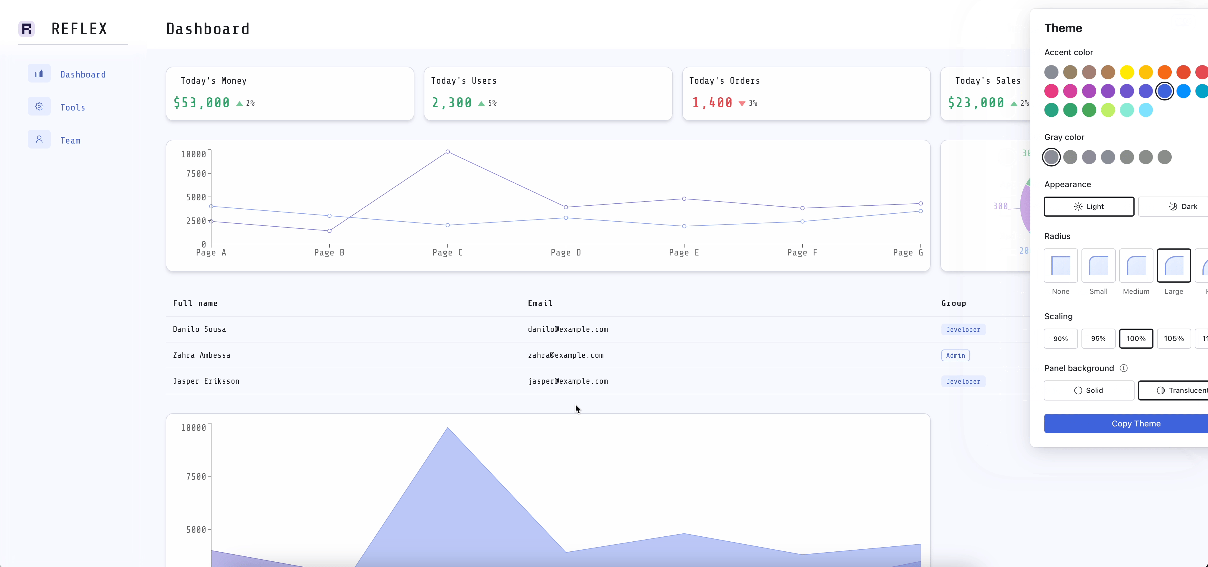
The new components can be styled together with the new unified theming system.
You can specify a theme in your rx.App to give your app a unified look and feel such as enabling dark mode, or setting an accent_color to match your brand.
app = rx.App(
    theme=rx.theme(color_mode="dark", accent_color="blue")
)
Many of the more complex components have defaults that work great out of the box. For example, by default you can render a Select with a list of options.
rx.select(["Option 1", "Option 2", "Option 3"])These high level APIs support most use cases and provide many customization options, as seen below.
rx.select(
    ["Option 1", "Option 2", "Option 3"],
    color_scheme="blue",
    size="3",
    placeholder="Select an option",
)
However, if you want more customization, you can also modify the internals of many components. For example, you can use the low-level API to customize each item within a rx.select.
rx.select.root(
    rx.select.trigger(placeholder="Select an option"),
    rx.select.content(
        rx.select.item("Option 1", value="option1"),
        rx.select.item(
            "Option 2",
            value="option2",
            background_color=rx.color("red"),
        ),
        rx.select.item(
            "Option 3", value="option3", disabled=True
        ),
    ),
)
You will always have full control over your app, while we aim to give you the best defaults and high-level APIs to get started quickly.
Currently only some components have high-level APIs, but we will be adding more in the future.
This release also includes the rx.color module that makes it easier to create colors and shades of colors throughout your app. In the future we will also add ways to define your own color palettes.
rx.card("This is a card", color=rx.color("grass", 8))We're excited to see what users build with our new components. Our next steps are to continue to improve the out of the box experience by providing more high level components so that you can focus on your ideas rather than fighting to get your app to look and feel right.
After this release, we will be focusing on the stability of the framework and the API, as we head to our 1.0 release.
To follow our updates you can:

Join Newsletter
Get the latest updates and news about Reflex.
Join Newsletter
Get the latest updates and news about Reflex.
Copyright © 2024 Pynecone, Inc.


